People do judge a book by its cover and first impressions count, particular online where a potential buyer may just glance at your book. If it’s dull you will lose customers; if it doesn’t reflect the genre and content of your book you could end up targeting the wrong audience.
Here are some book cover design tips, tricks and design rules that are universal, meaning they are tried and tested techniques and guidelines that work on a large variation of book covers.
Use White Space Wisely
Whitespace doesn’t have to be white, it is just visual silence and if used wisely it can add visual appeal to your book cover.
The following book covers use white space or negative space to illustrate a concept or idea. When used effectively it ensures that the background images or textures do not overlap or distract from the text on the cover.
For short titles or author names white space between the letters can create a panoramic effect, a sense of importance or grandeur. I’ve found that white-space with a plain background and a single key image tends to work best with non-fiction covers. Here are three non-fiction book covers that use white space wisely to convey an idea.
Get Extreme
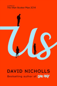
Another technique is to get extreme by making one element on your cover extremely big. This is usually an image but you can also do this with text. This is a simple technique that if pulled off well can create a very professional cover. Check out my design of the dollar bill that contains a blown up image of George Washington. The image is so large that it doesn’t fit on the cover. The other cover contains extremely large text where the word US takes up the entire width of the cover.
Whitespace doesn’t have to be white, it is just visual silence and if used wisely it can add visual appeal to your book cover.
The following book covers use white space or negative space to illustrate a concept or idea. When used effectively it ensures that the background images or textures do not overlap or distract from the text on the cover.
For short titles or author names white space between the letters can create a panoramic effect, a sense of importance or grandeur. I’ve found that whitespace with a plain background and a single key image tends to work best with non-fiction covers. Here are three non-fiction book covers that use white space wisely to convey an idea.



Create a Focal Point
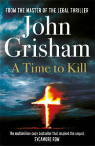
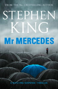
Consider creating a focal point. A focal point is typically the biggest, brightest, or the boldest, or the most different element on your page. It doesn’t have to be an image, it could be text. It gives your reader a place to focus. The following three covers use a focal point that involves a sharp change in color or characters from the book.


Here is a cover I created that uses a focal point. I did this by using a different color for one of the repeating images. This helps focus the eye, make the cover more interesting while still maintaining a simple look.

Choose the Text Wisely
Make sure to use a descriptive subtitle and teaser that make it clear what your book is about. Something worth considering when choosing the sub-title for your book is to use keywords that readers are likely to search for or keywords related to your genre as this will help your book rank higher for related keywords on sites such as Amazon. You should consider mentioning the genre in the sub-title. For Example a romantic comedy could include the words“…— A Romantic Comedy” in the sub-title.
Adding a teaser can make your book appear more professional. It should be short and to the point outlining the major plot (fiction) or goal of the book (non-fiction). The teaser should use a small and plain font. It should provoke interest and not give too much away.
Pick the Right Font
The text style and colour should reflect the image on the cover. Dark thrillers and Paranormal books will tend to have curly, pointed, hazy or glowing fonts; Romances will tend to have a lot of curls and decorations; Old English fonts and Gothic Medieval style font’s suit stories set in the past. Non-fiction books usually suit simple serif or sans-serif font. Of course there is a lot of overlap, but some fonts just suit some genres more than others.


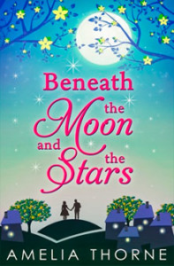
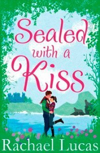


You should try and avoid using a fancy font more than once on the cover. If you use a fancy font or modified font for the title use a plainer font for the rest of the text.
Avoid using more than two different font family’s on your cover. Using only one or two helps ensure a more consistent and professional look.
Do download commercial and free fonts from sites such as myfonts.com and dafont.com. System fonts installed on your computer are plain and boring. Online fonts are less widely used and commercial fonts you pay for will be rarer and often higher quality with a larger variety of font weights.
Do consider tweaking an existing font for a more unique and specialized look. This could involve altering a letter to convey an idea or concept. Here is a cover I designed that has a font I tweaked to fits with the title of the book.

Try to Avoid Clutter
Try not to clutter the book cover with too much. Sometimes the most simple, minimalistic covers work best. Also the minimalist designs tend to be more legible as far as text is concerned. Text on a cluttered background can be harder to read.
Of course your customer may want to include many different images on the cover to reflect the characters, places and events in the book – in which case you don’t have much choice but to include them. However there are often ways to blend different images together making them appear part of the same scene and give the appearance of simplicity.
Book Series and eBooks
Book Series: If creating books that belong to a series you should maintain the same look and style for each book. This can mean using the same font, branding or colors so that they look like they belong together.
eBooks versus Print Books: Some will claim that eBooks require bigger or bolder font so they can be read easily on mobile devices. However the Title and description is right next to the thumbnail image of the book. Small text like reviews and blurbs makes your cover look traditionally published, and actually gives customers a reason to click on the cover and see the full view helping to draw the customer in.
Get Extreme
Another technique is to get extreme by making one element on your cover extremely big. This is usually an image but you can also do this with text. This is a simple technique that if pulled off well can create a very professional cover. Check out my design of the dollar bill that contains a blown up image of George Washington. The image is so large that it doesn’t fit on the cover. The other cover contains extremely large text where the word US takes up the entire width of the cover.
